
Usually, websites are designed differently for devices like mobile, laptops, and desktops. And in most cases, a website’s mobile version differs from what you see on your desktop computer. If you want to view mobile sites on your PC, you can easily enable mobile site view on the Firefox browser, as shown in this guide.
How to Enable Mobile Site View on Firefox Computer?
If you want to check the mobile site view from your computer using the Firefox browser, you have come to the right place. Below, we have added different methods to open the mobile version of a website in Firefox which can be useful if you’re a developer or just someone who wants to access the mobile view. Read on.
Method 1- Using the Firefox’s Inspect Feature
Step 1: Open Mozilla Firefox and head to a website whose mobile site you want to check.
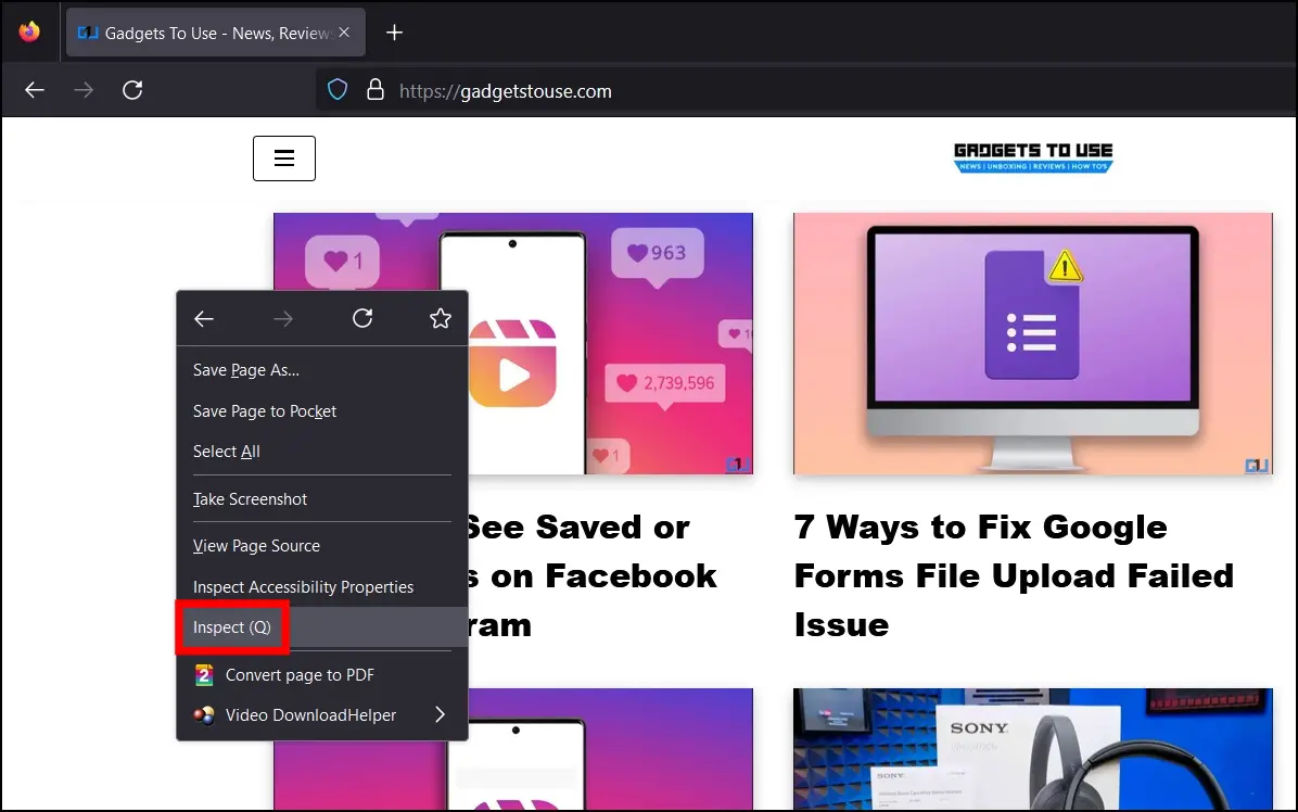
Step 2: Right-click on the page and select Inspect.
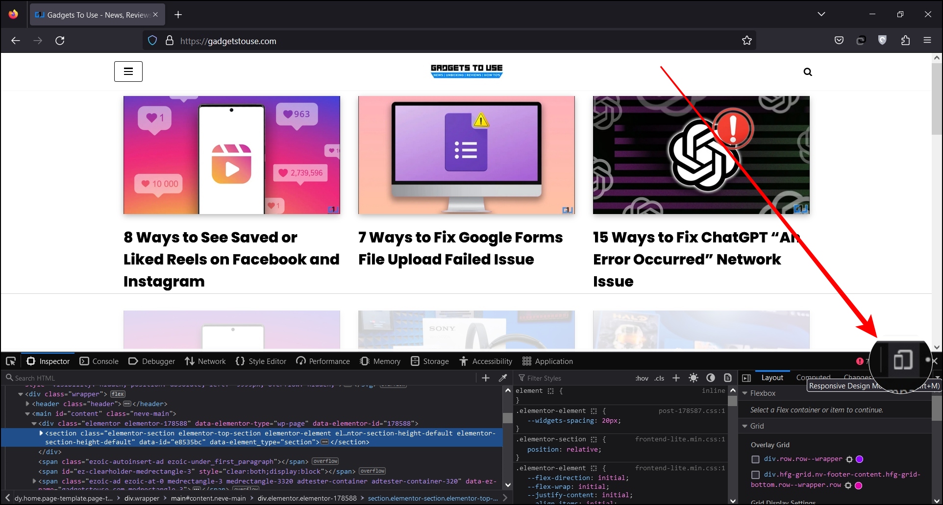
Step 3: Tap Responsive Design Mode in the top-right corner of the toolbar.
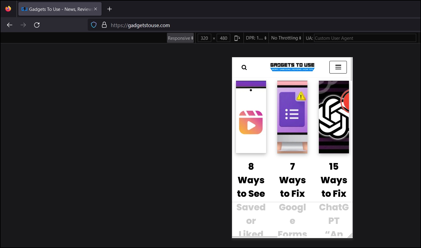
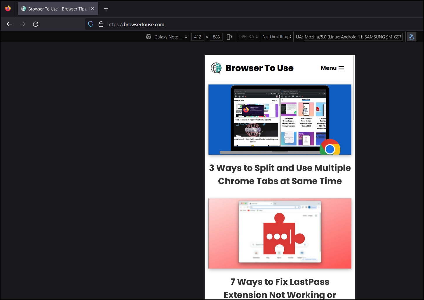
Now, Firefox will load the webpage in responsive mode, which you can change to different resolutions. To change it, tap on the Responsive drop-down menu at the top and select a device from the list whose mobile version you want to check, or you can directly enter the resolution in pixels.
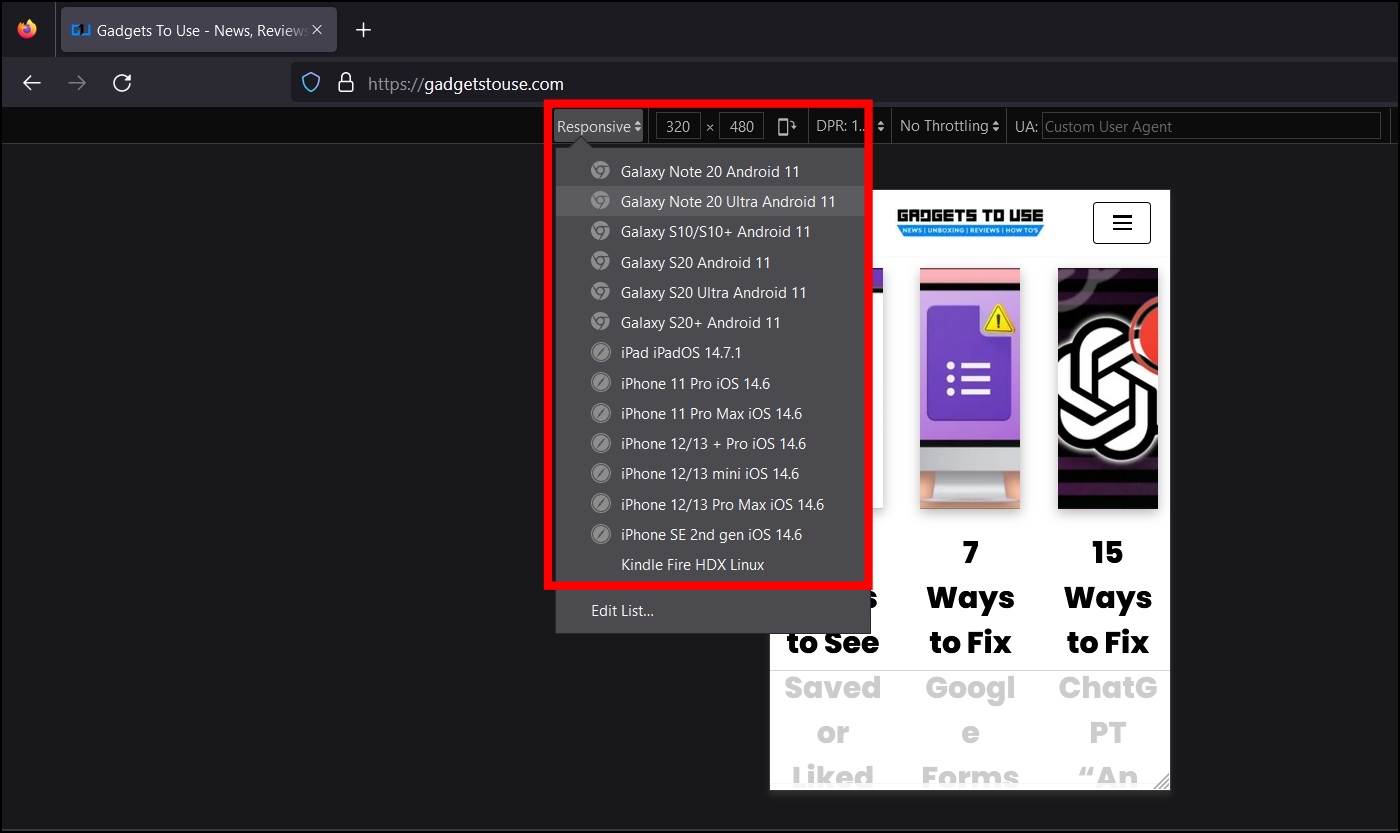
For example, select Galaxy Note 20, and you’ll see the website exactly how it will look on that particular Android phone. You can also see how the website would look on an iPhone and iPad using the given options.
Method 2- Using Responsive Design Mode
Firefox has a responsive design mode that enables users or developers to modify a website’s resolutions to view the page’s mobile version. This method is very similar to the Inspect ones, as the Inspect tool opens the responsive design mode when switching devices. Follow the below steps to use the feature to view the mobile site.
Step 1: Open a website on the Firefox browser whose mobile site you want to check.
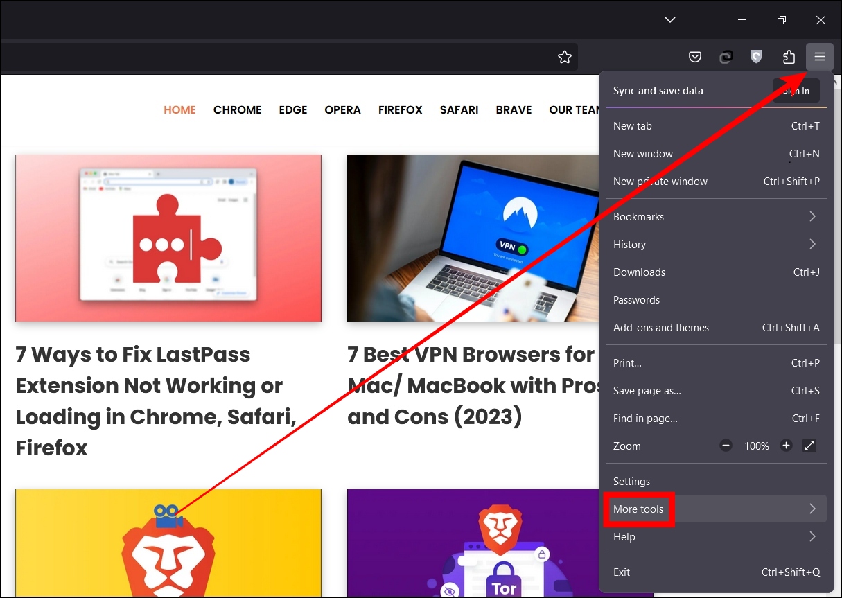
Step 2: Click on the hamburger menu at the top-right corner and click More Tools.
Step 3: Select Responsive Design Mode from the options that appear.
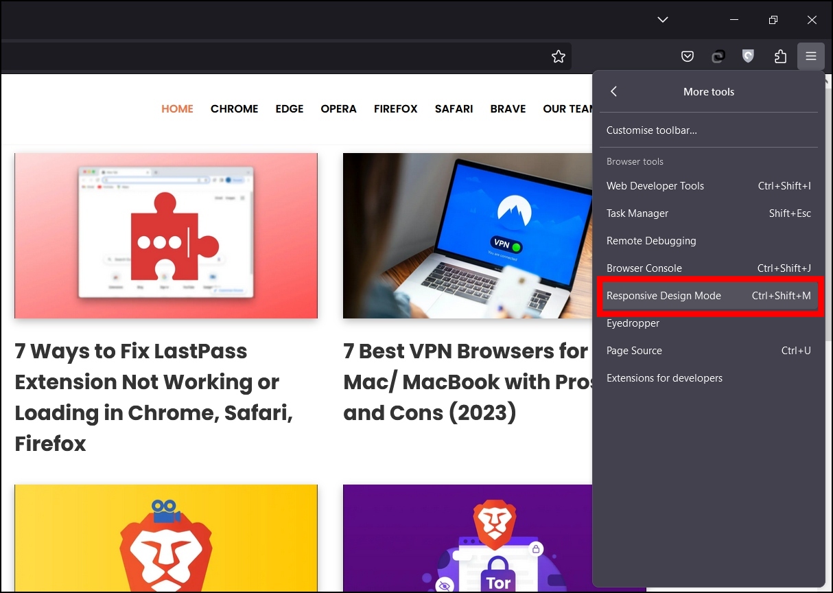
Once you do, the web page will load in the responsive design mode of a mobile version that you can also change to screen different resolutions.
Method 3- View Mobile Site With an Online Emulator
You can also use an online emulator to view mobile sites. For the unaware, emulators allow a computer or mobile system to behave like another; they are used for testing apps, but some are available for website responsiveness.
Step 1: Visit and copy the URL of the website whose mobile site you want to view.
Step 2: Open an emulator website, example: lambdatest.com.
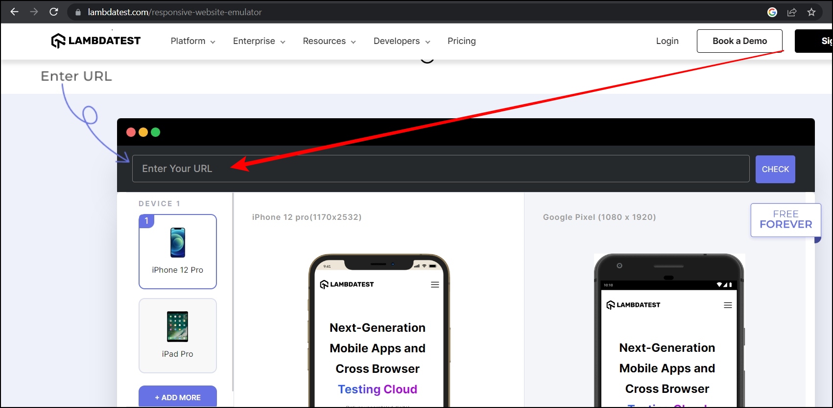
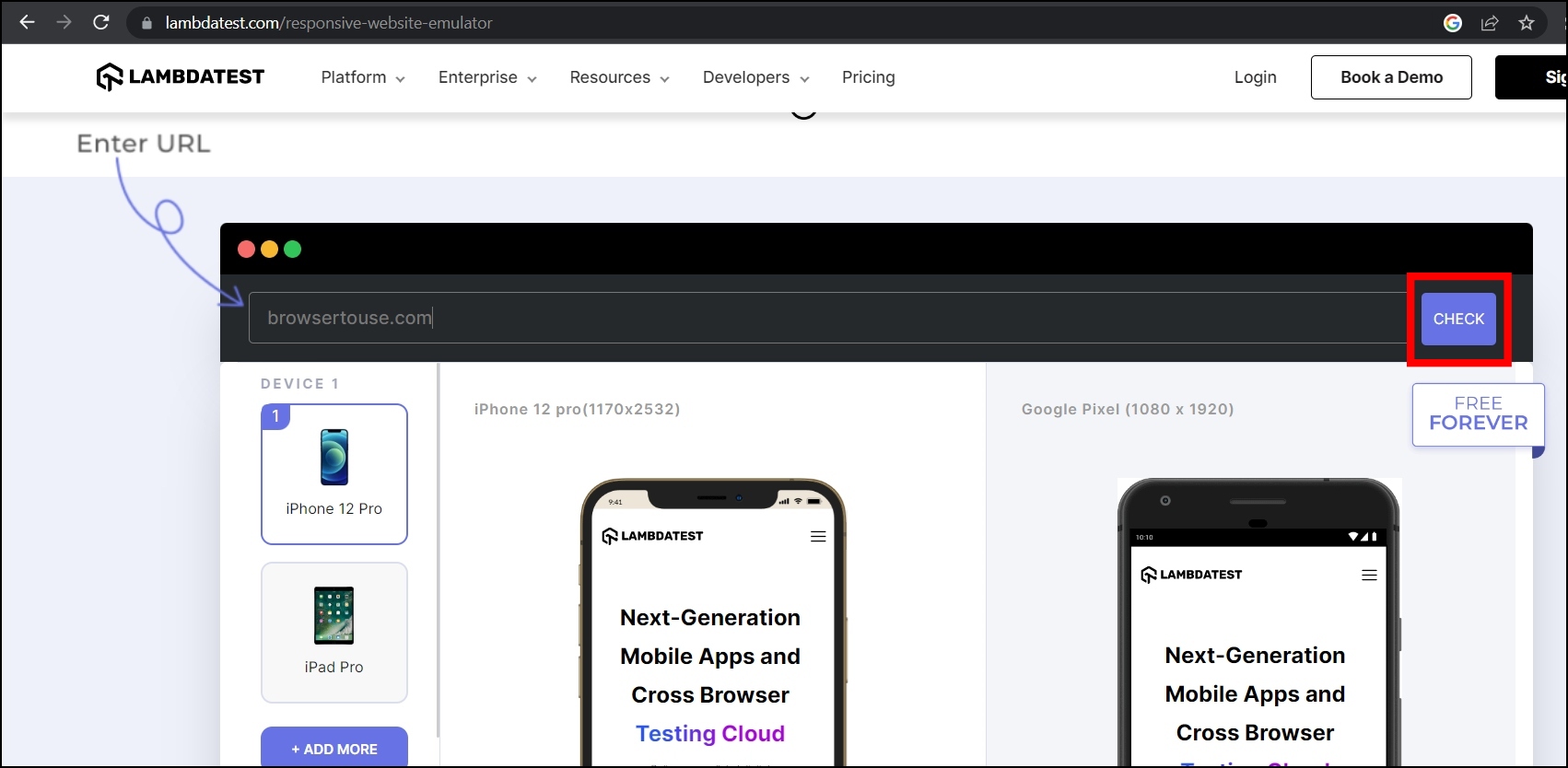
Step 3: Enter the copied URL and click on the Check button.
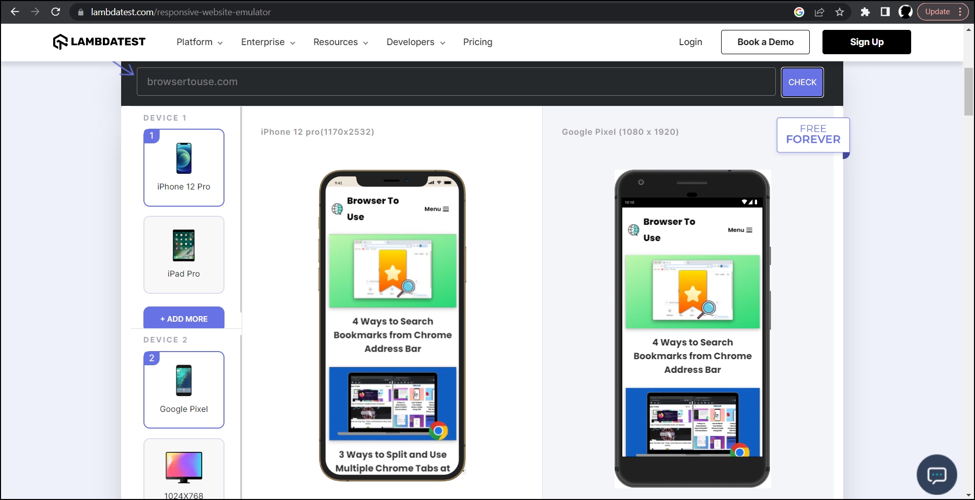
Step 4: Once you follow the above steps, you will see the mobile version of the website on your computer in the Firefox browser.
Method 4- Mobile View Tester Firefox Add-On
The Mobile View Tester add-on lets users check websites on different mobile phones. However, it also features a few popular mobile phone models like the Galaxy S10, Pixel 2 XL, iPhone X, etc. Follow the below steps to install and use the extension.
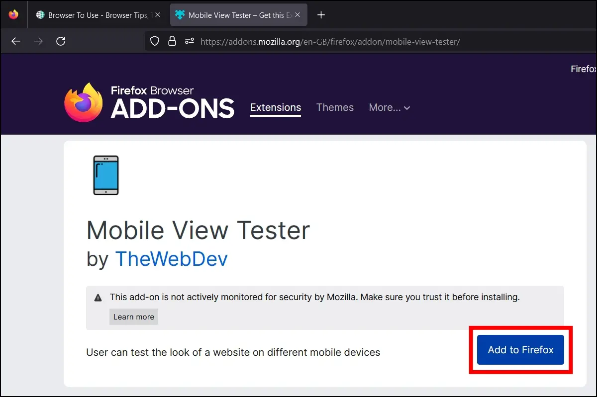
Step 1: Open the Mozilla Firefox Add-on Store.
Step 2: Search for Mobile View Tester and head to the extension page.
Step 3: Add the add-on to the browser by tapping on Add to Firefox > Add.
Step 4: After adding it, open a website whose mobile view you want to see. Tap on the extension menu icon at the top-right corner of the toolbar and select Mobile View Tester.
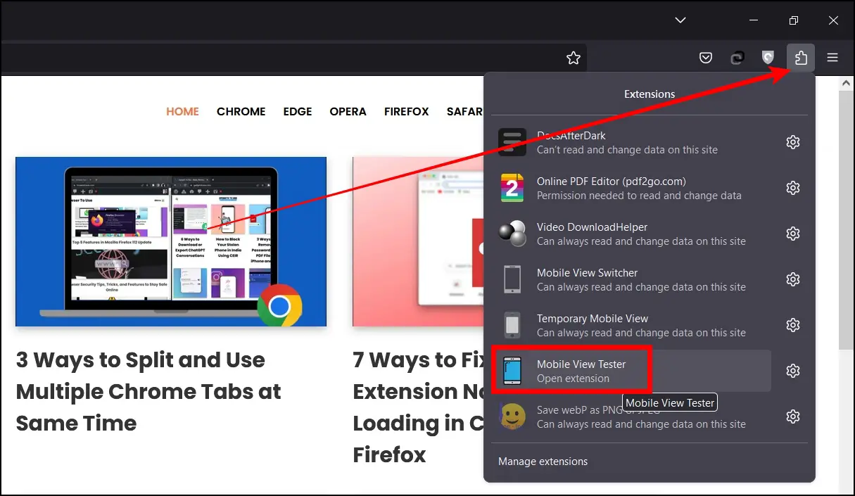
Step 5: Select a device from the list.
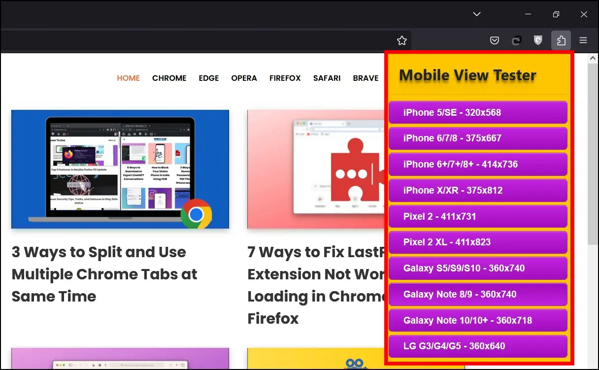
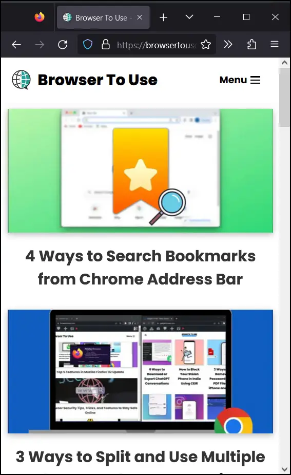
Once done, the extension will load the website per your selected mobile device.
Wrapping Up
This is how you can enable the mobile site view on a Firefox computer. I hope the above article helped you see the mobile view of a website on the Mozilla Firefox browser from your computer. If you have any queries about the article, let us know in the comments below. Stay tuned to BrowserToUse for more such articles and how-tos.
Related:
